book (design) story #579
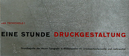
jan tschichold:
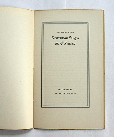
formenwandlungen der &-zeichen
d. stempel ag, frankfurt am main, 1953
printer: hausdruckerei der d. stempel ag, frankfurt am main
size: ?? x ?? cm
designer: jan tschichold
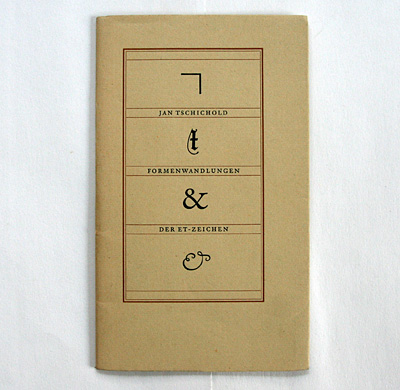
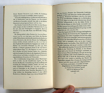
another example of swiss neo-traditional book design of the mid-20th century: this cute booklet is a testimony of ...
... jan tschichold's (1902-1974) profound interest in and knowledge of type history: ...
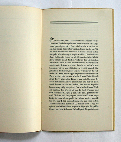
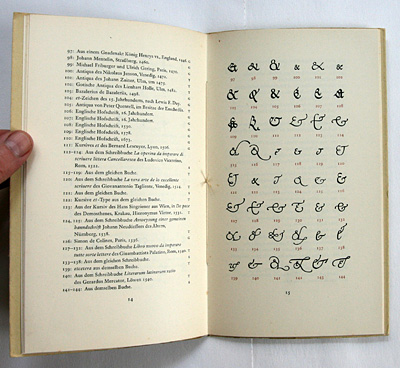
... you learn everything you ever need to know about the development of the ampersand (&) sign ...
... which stems from a latin "et" (=and) ligature of roman times.
printed by the in-house workshop of the stempel typefoundry in frankfurt/main, ...
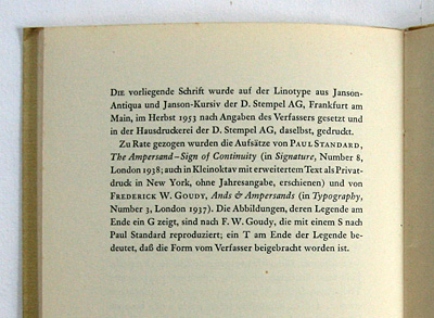
... the booklet is a showpiece of tschichold's "post-modernist" typography. note details like the centred "shrinking" of the final paragraph – to end with just the author's initials (and no page number): jt literally gets to the point here!
--------------------------------------
book (design) stories home
index of published book (design) stories